
Wealth Management Web Design: Why Top Sites Convert Clients

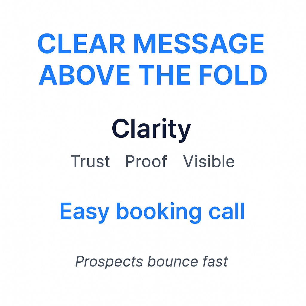
In 2026, most wealth management websites lose clients before they ever read past the headline. A busy prospect lands on the page, can’t figure out what you do or who you serve, and bounces in under 10 seconds. No call booked. No lead captured. Just gone. A CIO told me last month he left a site because the “Book” button was hidden in a menu, he didn’t send feedback; he just left.
The fix isn’t a prettier logo. It’s clear messaging, visible trust signals, and a booking path that doesn’t make people work. The data backs this up: over 60% of high-net-worth clients expect integrated digital experiences, and more than 50% would switch providers if the digital experience feels outdated. Personalization alone can lift conversions by over 200%. You don’t need a $100K custom build to get this right.
The patterns top wealth management websites get right
-
Lead with one clear promise above the fold , who you serve and what outcome they get.
-
Put “Book a call” where the eye naturally lands , hero section, sticky header, and mid-page.
-
Show proof fast , credentials, fiduciary stance, awards, real numbers, recognizable logos.
-
Keep navigation simple , 5–7 items max, no maze of dropdowns.
-
Reduce form friction , fewer fields, a privacy note, and a clear “what happens next.”
-
Explain services in plain English , no jargon.
-
Make mobile feel effortless , fast load, big tap targets, short sections.
Case studies: wealth management websites that convert visitors into clients
1. Capture attention fast with an interactive, trust-first homepage (Wealthspire Advisors)
Wealthspire leads with an autoplay video hero , movement catches the eye immediately. The primary call to action (CTA) sits above the fold in a color that contrasts against the blue-and-yellow trust palette. The first trust cue (firm stats and credentials) appears within the first scroll, not hidden at the bottom.
Their trust stack is layered well: stats, badges, and press mentions are spaced with enough white space that they breathe instead of cluttering. Nothing feels crowded.
The conversion path is smart. After the hero, visitors are routed to an interactive tool or a “Start Here” flow , not a generic contact page. That one step reduces hesitation and moves people toward a meeting without pressure.
This approach works best for full-service firms targeting modern, sophisticated clients who expect a polished digital experience.
Steal this:
-
Use a video or high-quality visual hero with a CTA that is visible above the fold.
-
Place your biggest proof point (stat, credential, media mention) in the first scroll.
-
Route uncertain visitors to a “Start Here” flow, not a generic contact page.
Fix this if you see it:
-
A homepage that leads with firm history instead of client outcomes.
-
CTAs hidden below the fold with no repeat placement.
2. Sell clarity with transparent pricing and a simple CTA (Facet Wealth)
Facet Wealth’s value proposition reads like a real person wrote it , not a compliance committee. Their hero copy is plain, specific, and benefit-focused. No buzzwords.
Their flat-fee pricing model is displayed openly on the site. This single move eliminates one of the biggest sales objections before a prospect ever talks to anyone. When people know what they’re paying, they stop stalling.
CTAs appear multiple times in different formats. Beneath each CTA button, there’s a “doubt remover” line , something like “No commitment required” or “Cancel anytime” , that quietly handles objections.
Strong CTA variations in this style:
-
“See plans” (low commitment, works for browsers)
-
“Book an intro call” (direct, works for ready-to-talk prospects)
Steal this:
-
Show pricing or at least pricing structure , transparency reduces hesitation.
-
Add one short doubt-remover line under every CTA button.
-
Use natural language in your value proposition; write it like you’d say it out loud.
Fix this if you see it:
-
Pricing hidden behind a “contact us to learn more” wall.
-
CTA buttons with vague copy like “Learn more” or “Get started.”
3. Scale trust using brand polish and predictable navigation (Northwestern Mutual)
Northwestern Mutual’s site doesn’t surprise you , and that’s the point. Consistent typography, generous spacing, and a consistent design communicate stability. For high-net-worth clients, “safe and credible” is a feature.
Navigation is grouped logically. Large sites can overwhelm, but their approach uses clear labels and intuitive grouping so visitors find what they need without confusion. There’s no dropdown maze.
Lead capture is segmented by intent. Existing clients go one way; prospects go another. That separation keeps both journeys clean and relevant.
Steal from them without the enterprise budget: Create two clear homepage pathways , one for existing clients (“Client Login”) and one for prospects (“Talk to an Advisor”). You don’t need their budget to implement this; you just need the decision to do it.
Steal this:
-
Consistent visual design signals stability , don’t mix fonts, colors, or button styles.
-
Segment your homepage for two audiences: existing clients and new prospects.
-
Use plain navigation labels, not internal jargon.
Fix this if you see it:
-
Navigation with 10+ items and nested dropdowns.
-
One contact page trying to serve both clients and prospects.
4. Move visitors from “curious” to “ready” with a consultation-first flow (Plancorp)
Plancorp structures pages in the right order: problem → approach → proof → CTA. Too many advisory sites flip this and open with their credentials before the visitor even knows you understand their situation.
Mid-page CTAs appear after benefits and proof , not before. This matters. Asking for a meeting before you’ve built any case is like proposing on a first date.
A visitor can tell within two scrolls whether Plancorp is for them. That clarity is rare, and it converts.
Microcopy that works well here: “No pressure , just 15 minutes to see if we’re a fit.” That one line lowers the perceived stakes of booking a call significantly.
Steal this:
-
Structure every service page: problem → approach → proof → CTA.
-
Place your mid-page CTA after proof, never before.
-
Use a low-stakes phrase near the booking CTA to reduce anxiety.
Fix this if you see it:
-
Pages that open with firm history before addressing the prospect’s situation.
-
CTAs placed before any evidence has been presented.
5. Feel personal without feeling casual (Covenant Wealth Advisors)
Covenant uses calm blues, friendly language, and a hero image that feels warm without feeling like a stock photo. The copy sounds like a person, not a brochure.
Their imagery shows real interactions , advisors with clients, genuine expressions , not staged handshakes or generic skyline shots. That distinction is important.
Their team section goes beyond headshots. Each bio includes credentials, specialties, and a personal note on why they do this work. Those three elements , credential, niche, personal why , are what actually build trust in a team section.
Three “team bio” fields worth including:
-
Credential (CFP, CFA, etc.)
-
Niche or specialty (retirees, equity compensation, small business exits)
-
Personal why (what drew them to this work)
Steal this:
-
Choose photos that show genuine interaction, not staged corporate imagery.
-
Write team bios with credential + niche + personal why.
-
Keep your tone human and calm , warmth and professionalism are compatible.
Fix this if you see it:
-
Team pages that list titles but give no insight into who the person is.
-
Stock photos of people shaking hands in suits.
6. Launch fast with a template-driven site that still looks custom (Squarespace advisor examples: Consilio Wealth / Pathway Financial / Capstone Advisors)
These three advisor sites prove that “template” doesn’t mean “generic.” Each uses a clean structure: services section, credibility gallery, contact block. The layouts are organized, the messaging is clear, and they were likely live in weeks, not months.
A credibility gallery , logos of associations, press mentions, regulatory affiliations , does a lot to reduce doubt without requiring the visitor to read anything.
The biggest takeaway here is that a good, live site beats a perfect, delayed one every time. Prospects aren’t grading you on custom animations. They’re deciding whether to trust you and book a call. As a quick test, if your aunt can’t fill out your form on her phone while waiting for coffee, it’s too long.
Three template sections that typically drive leads:
-
Services grid (clear labels, short descriptions, links to full pages)
-
Proof strip (logos, credentials, fiduciary badge)
-
Booking block (embedded calendar or minimal contact form)
Steal this:
-
Place your credibility gallery in the first two scrolls.
-
Use a services grid with plain labels , not internal names.
-
Get live fast; optimize from real traffic data.
Fix this if you see it:
-
Sites stuck in “almost done” for months.
-
Services pages with no proof or CTA near the bottom.
“Steal these conversion components” checklist
|
Component |
What good looks like |
Where it goes |
Quick win |
|---|---|---|---|
|
Hero message |
One sentence: who you serve + their outcome |
Top of homepage |
Rewrite your tagline to name the client type |
|
Primary CTA |
“Book a call” or “Schedule intro” , clear verb |
Hero, mid-page, footer |
Add CTA to hero if missing |
|
Secondary CTA |
Lower commitment offer , guide, quiz, tool |
Mid-page, blog |
Add a lead magnet opt-in |
|
Trust proof strip |
Credentials, logos, fiduciary badge |
Below hero |
Build a simple logo/badge row |
|
Services overview |
3–5 services, plain labels, one-line descriptions |
Homepage + navigation |
Remove jargon from service names |
|
Process / how it works |
3 clear steps from inquiry to plan |
Service pages, about |
Add a “how we work” section |
|
Team snapshot |
Photo + credential + niche + why |
About page |
Update bios to include all three |
|
Testimonials / case studies |
Specific outcomes, not generic praise |
Service pages, homepage |
Add one specific client result |
|
Lead magnet |
Guide, checklist, or assessment |
Blog, sidebar, mid-page |
Create one downloadable resource |
|
Footer CTA |
Repeat primary CTA |
Every page footer |
Add CTA block to footer template |
Templates and platforms that get you 80% there
1. Choose Squarespace where speed and simplicity matter
Squarespace works for advisors because it’s mobile-ready out of the box, handles SEO basics without plugins, and keeps the design clean without much effort.
Look for templates with: a scheduling block, a testimonials slider, case study sections, and opt-in forms. These four features handle most of your conversion needs.
Squarespace Templates for Wealth Management:
-
Degraw: Finance-focused, text-heavy template.
-
Cedar: Features detailed financial pages and scheduling blocks.
-
Coin: Characterized by a sticky header and blog functionality.
-
North: Designed with sections for services and pricing.
-
Elevate: Includes testimonials and case studies sections.
-
You can browse more options in the official Squarespace library for finance templates.
Cost reality: Templates run $68–$151 as a one-time purchase, plus the Squarespace platform subscription. Squarespace offers trial periods and extended free options before you commit.
Build these three sections first for fastest launch:
-
Hero with CTA
-
Services grid
-
Booking or contact block
2. Choose WordPress where content and SEO are a long-term play
WordPress gives you flexibility that no hosted platform can match. It handles content depth, local SEO, and plugin customization well. There are 107+ premium themes built for finance.
WordPress Themes for Financial Advisors:
-
Financial Advisor Divi: A demonstration theme for wealth professionals.
-
Nexus Financial Advisor: A dedicated WordPress theme.
-
Advisor Designs customized themes: Options like Diesel and Grandin are designed for wealth managers.
Watch-outs: WordPress requires ongoing maintenance , updates, security patches, plugin conflicts, and performance tuning. Budget time or money for this.
Five essential plugin categories:
-
SEO (Yoast or Rank Math)
-
Caching (WP Rocket or W3 Total Cache)
-
Forms (Gravity Forms or WPForms)
-
Security (Wordfence)
-
Analytics (GA4 integration or MonsterInsights)
3. Choose Webflow where design quality and speed are essential
Webflow gives you design control close to custom development , without the plugin overhead. Sites load fast, look sharp, and don’t degrade over time the way heavily plugged-up WordPress sites can.
Webflow Templates for Financial Advisors:
-
MoneyCo: Geared towards fintech and investment firms.
-
Hera: Designed for finance advisors, offering 5 different homepages.
-
Efito 128: Suitable for consulting and financial institutions.
-
Advisor X: A theme for financial consulting.
-
You can search the Webflow marketplace for “financial advisors” templates.
Watch-outs: Your team needs training to edit Webflow. Platform handoff and CRM integrations require planning upfront.
Three pages that shine in Webflow:
-
Homepage (custom animations, clean sections)
-
Service landing pages (fast-loading, designed to convert)
-
Lead magnet pages (optimized for opt-ins)
4. Choose advisor-hosted platforms where compliance workflows are essential
These platforms are built for advisors. They include compliance workflows, archiving, marketing CMS features, and advisor-specific templates.
Key Compliance Workflows, Archiving, and Disclosure Management for Advisor-Hosted Platforms:
-
One-Click Compliance Workflows: Automates approval processes for all digital communications, including emails, social media posts, blog content, and website updates. Routes content to a compliance inbox, provides a real-time dashboard for status and history, and ensures efficient oversight.
-
Integrated Archiving: Seamlessly integrates with custodian/broker-dealer systems for SEC Rule 17a-4 compliant vault archiving of all website updates and digital communications.
-
FINRA/SEC-Approved Archiving: All website and blog changes, edits, and digital communications are archived and accessible at any time.
-
WORM Storage (Write Once, Read Many): Every published item is stored in a non-rewritable, non-erasable format, ensuring data integrity.
-
Searchable Archives: Provides comprehensive, searchable archives with printer-friendly and full views for easy retrieval during audits.
-
Automated Approval Workflows: Includes notification systems for changes, allowing for compliance review (approve/reject) with live chat, attachment capabilities, and efficient list/calendar views.
-
Disclosure Management Tools: Support centralized management and automated integration of necessary disclosures across website content.
Watch-outs: Design flexibility is limited. Portability can be an issue if you want to move platforms later. Add-on features can push costs up.
Checklist for vendor demos:
-
Content archiving and retrieval
-
Approval workflows and revision logs
-
Disclosure management tools
-
How quickly compliant edits can be published
Platform comparison for wealth management web design
|
Option |
Best for |
Time to launch |
Ongoing effort |
Typical budget band |
Main risk |
|---|---|---|---|---|---|
|
Squarespace |
Fast, simple advisor sites |
1–3 weeks |
Low |
$68–$151 template + subscription |
Limited customization |
|
WordPress |
SEO and content-heavy sites |
3–8 weeks |
Medium–High |
$500–$5,000+ setup |
Plugin issues, maintenance overhead |
|
Webflow |
Design-forward, fast sites |
4–8 weeks |
Medium |
$3,000–$10,000+ |
Editor learning curve |
|
Advisor-hosted platforms |
Compliance-heavy firms |
2–4 weeks |
Low–Medium |
$100–$400/month |
Design limits, portability issues |
|
Custom agency build |
Full-service, long-term investment |
8–20 weeks |
Low (if maintained) |
$10,000–$50,000+ |
Cost overruns, long timelines |
Page-by-page blueprint for a high-converting wealth management site
Homepage , first impression and direction
Goal: Communicate who you serve, build immediate trust, and route visitors to the right next step.
Essential blocks:
-
One-sentence promise naming the client type and outcome
-
Proof strip (credentials, fiduciary badge, press/associations) below the hero
-
3–5 services with plain labels
-
Primary CTA repeated three times: hero, mid-page, footer
-
A “Start Here” route for visitors who aren’t sure yet , link to a quiz, assessment, or short explainer
Service pages , turn interest into intent
Goal: Make the right prospects self-identify and take action.
Essential blocks:
-
Who it’s for (bullets, not paragraphs)
-
What you do and how it works (3 clear steps)
-
A mini case study or testimonial placed near the CTA
-
One conversion tool , calculator, quiz, or assessment , for visitors not ready to book yet
About page , trust and fit
Goal: Answer “can I trust these people and are they right for me?”
Essential blocks:
-
Fiduciary stance and fee model in plain language
-
Team credentials (CFP, CFA where relevant) plus a human “why”
-
What it’s like to work together , expectations and timeline
-
Two CTAs: “Meet the team” and a booking option
Blog and insights , authority and SEO
Goal: Attract the right search traffic and convert readers into leads.
Essential blocks:
-
Topics mapped to actual client questions: tax moves, retirement income, exit planning, equity compensation
-
End-of-post CTA tied to the article topic
Example: An article on equity compensation strategies ends with , “Managing RSUs or options? Download our equity comp checklist and book a 20-minute review.”
Contact and booking page , remove friction
Goal: Get the meeting booked without making people work for it.
Essential blocks:
-
Minimal fields: name, email, one qualifying question
-
Embedded calendar or clear next steps
-
Reassurance lines: privacy note, response time, who will reply
What happens after you book:
-
You’ll get a confirmation email with a calendar invite.
-
A team member reviews your note before the call.
-
We show up ready to talk about your specific situation , no generic pitch.
CTAs and lead capture that feel natural
Primary CTA options that convert
-
Offer “Schedule an introduction call” for prospects who are ready to talk.
-
Provide “Get a second-opinion review” for comparison shoppers evaluating options.
-
Give “Take a retirement readiness check” for visitors not quite ready to commit.
-
Share “Download the onboarding checklist” for cautious, detail-oriented prospects.
Form and booking rules that enhance conversions
Fewer fields with a clearer payoff outperform long forms every time. Add a doubt remover under every button , “No obligation,” “We won’t spam you,” “15-minute call, that’s it.”
Place CTAs in three spots: hero (before they scroll), mid-page (after proof), and end of page (before they leave). Moving a CTA higher on the page can increase click-through rate by approximately 32%. Low-friction forms , fewer fields, clear payoff , can lift submissions by up to 68%.
Trust signals that matter (and where to place them)
Proof to show without clutter
-
Display credentials (CFP, CFA) near team names and in the homepage proof strip.
-
Add fiduciary and fee-only clarity near the primary CTA and on the About page.
-
Feature testimonials with specific outcomes , not generic praise.
-
Include security and privacy cues near every form in plain language.
-
Show media mentions and awards only if they’re recognizable and current.
Compliance, accessibility, and security
Keep disclosures in the footer and add context-specific snippets on relevant pages , don’t hide them, but allow for a good user experience.
Accessibility basics: sufficient color contrast, readable font sizes, keyboard navigation support, and alt text on all images.
Performance basics: compress images, limit heavy scripts, and prioritize fast mobile load times.
Compliance-friendly content workflow:
Draft → Compliance review → Approval → Publish → Archive
This four-step loop keeps you clean without slowing the team down unnecessarily.
Picking a web design partner
Questions that separate strategy from pretty mockups
-
Ask for 2–3 finance-specific examples and what actually changed after launch , leads, bookings, load speed.
-
Request a draft sitemap and homepage wireframe before any visual design starts.
-
Confirm who handles compliance edits and how the approval process works.
-
Require GA4 and Google Search Console setup plus conversion tracking from day one.
-
Clarify ongoing costs upfront , hosting, maintenance, content updates, and testing.
Deliverables to insist on in the proposal
-
Sitemap
-
Wireframes
-
Copy support or review
-
Design system (fonts, colors, button styles)
-
Mobile layouts
-
SEO basics (page titles, meta, image optimization)
-
Tracking setup (GA4, Search Console, conversion events)
-
Handover and training
-
Ongoing maintenance plan
A small tip from the trenches: if an agency can’t explain their measurement plan in under a minute, smile and back away slowly.
Professional Web Design Services Specializing in Wealth Management:
-
Matt Gerber Designs: Focuses on custom, strategy-driven website design with compliance expertise for advisors.
-
Select Advisors Institute: Specializes in customized, SEO-optimized websites for wealth management firms since 2014, offering custom design, compliance alignment, brand development, and content strategy services.
-
Digital Marketing Institute (DMI): Provides professionally designed, lead-focused financial advisor websites with expertise in financial services.
-
Flamingo Agency: A Chicago-based financial website design agency known for completing websites within 2-3 weeks (e.g., Kingston Capital Management’s website).
-
Innovative Media Creators (IMC): Offers custom financial advisor website design with custom content, imagery, and Calls-to-Action, maintaining a portfolio of 15+ custom design examples updated monthly.
-
Azuro Digital: Highlights best financial website designs (e.g., Wealthspire Advisors, Betterment, Facet Wealth).
-
Orbit Media Studios: A team of web design and development experts building high-performing websites for the financial services industry.
-
IFA Web Pro: Features top wealth management website designs and serves an international client base.
Budget and timeline reality check
|
Option |
Setup cost |
Monthly cost |
Typical timeline |
Notes |
|---|---|---|---|---|
|
Template + platform subscription |
$68–$500 |
$20–$50 |
1–3 weeks |
Best for lean, fast launches |
|
Advisor-hosted platform |
$500–$2,000 setup |
$100–$400 |
2–4 weeks |
Compliance built in |
|
Custom / agency build |
$10,000–$50,000+ |
$200–$1,000+ |
8–20 weeks |
Highest flexibility, highest risk of overrun |
What to measure after launch
Primary KPIs:
-
Booked calls
-
Form submissions
-
CTA click rate
-
Cost per lead (if running paid ads)
Page-level checks:
-
Homepage CTA click-through rate
-
Service page scroll depth
-
Contact page drop-off rate
Four-week optimization loop:
-
Week 1: Set baseline metrics for each KPI.
-
Week 2: Make one change (button placement, headline, form length).
-
Week 3: Measure the impact.
-
Week 4: Keep what worked, roll back what didn’t. Repeat.
30-day action plan to improve your wealth management website
-
Tighten your hero message to one sentence , who you serve and what outcome they get.
-
Add a proof strip below the hero with credentials, fiduciary clarity, and any press or associations.
-
Simplify navigation to the shortest path to “Book a call.”
-
Replace long contact forms with a minimal form plus a scheduling option.
-
Create one high-intent service page with proof, a CTA, and a short FAQ.
-
Publish one lead magnet and link it from your blog and relevant service pages.
-
Set up GA4, Search Console, and conversion event tracking , then review weekly.
Free Resources for Wealth Management Website Design
Open-Source Software:
-
Ghostfolio: An open-source wealth management software built with web technology that tracks stocks, ETFs, and cryptocurrencies. It features various charts, portfolio analysis, dark mode, and a Progressive Web App (PWA) mobile-first design. The Ghostfolio GitHub community has 257 contributors, an active Slack channel, and strong social engagement.
Free Templates:
-
Deploi Wealth Management Figma Template: A free template inspired by top-performing wealth sites, featuring a clean design and customizable Calls-to-Action (CTAs).
-
Wealth Financial Web UI (Figma): Contains 30 pre-made screens and over 180 editable components covering personal finance, household expenses, health, retirement, and education planning.
-
ProsperEdge (Drag-and-Drop): A free drag-and-drop wealth management template with pages for homepage, about, case studies, and contacts.
-
LeadCenter.AI: A free financial advisor website template with lead management integration, unlimited bandwidth, and free hosting.
-
TemplateMonster: Offers 12+ free financial advisor HTML website templates, including responsive designs.
-
HubSpot CMS Marketplace: Provides over 30 financial services templates, many of which are free, including options like Bizphile, Encompass, and Financia.
Design Inspiration Communities:
-
Dribbble: Features 12+ wealth management website designs for discovering designer work and inspiration.
-
Thomas Digital: Showcases 40 best-designed wealth management websites with detailed design breakdowns.
FAQs
Is $500,000 enough to work with a financial advisor?
Yes. Most wealth management firms will work with clients who have $500,000 or more in investable assets. Some firms set minimums lower; others, particularly those targeting ultra-high-net-worth clients, set them higher. At $500K, you have access to a solid range of full-service advisory options including tax planning, investment management, and retirement income strategies. The right advisor at this level can significantly impact your long-term outcomes , the key is finding one who specializes in clients at your asset level.
What are the 5 types of wealth management?
Wealth management typically covers five core areas: investment management (building and managing your portfolio), financial planning (budgeting, retirement, and goal-setting), tax planning (minimizing tax liability across income and investments), estate planning (structure how wealth transfers to heirs or charity), and risk management (insurance and asset protection strategies). Top firms handle all five in an integrated way rather than treating them as separate services.
Is $100,000 enough to work with a financial advisor?
It depends on the firm. Many independent financial advisors and fee-only planners will work with clients at the $100,000 mark, especially those who are accumulating wealth and have complex income situations. Robo-advisors and hybrid platforms often have lower minimums or none at all. At this asset level, hourly or flat-fee advisors can be a cost-effective option rather than percentage-based AUM models.
Can you make 7 figures in wealth management?
Yes, and it’s not uncommon at the top of the profession. Senior advisors and partners at established RIAs managing hundreds of millions or billions in assets can earn seven figures through a combination of management fees, equity in the firm, and performance bonuses. The path typically involves building a strong client base, moving upmarket toward high-net-worth and ultra-high-net-worth clients, and either building your own firm or becoming a partner in one. It takes years, but the economics of AUM-based revenue make high income very achievable at scale.